We build static ads alongside video, and the question we keep coming back to is what makes someone pause at a still image. This is why we are learning about composition, contrast, copy placement, and the first impression a single frame makes.
Why Static Ads Deserve More Credit
Video gets almost all the credit in digital advertising conversations. Hook rates, retention curves, and the first three seconds: modern brand creative has been built almost entirely around motion. Static digital ads sit somewhere in the background. These are treated as a necessary output rather than a format worth thinking seriously about.
That is the wrong way to look at it.
A static ad is not a simpler version of a video. It operates under entirely different conditions. No sequence, no movement, no audio carrying the message forward. One frame, held still, in a feed that never stops. Someone either pauses or they do not. That decision happens faster than conscious thought. What makes a static ad stop the scroll is not a design question. It is a creative direction question.
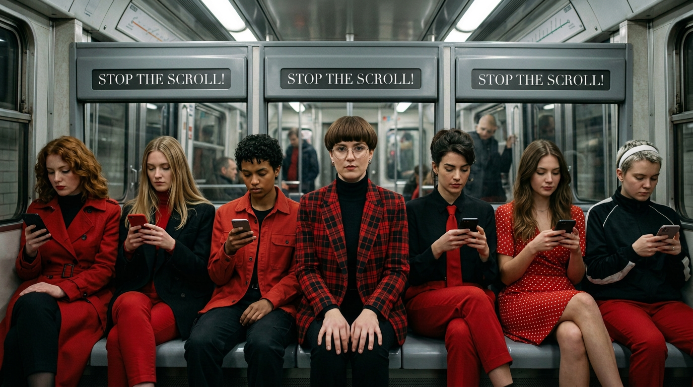
The Scroll Is a Reflex. Interrupting It Requires More Than a Nice Visual.
Most people scrolling through any feed are not looking for anything in particular. The motion of the thumb is largely automatic, almost meditative. Content passes in a blur until something creates enough visual friction to register. A study published in Nature Communications by European researchers found that as available content increases, collective attention spans narrow. People cycle through topics faster. The total attention stays roughly the same. It is just divided across far more content than before. The threshold for earning a pause has gone up, not down.
Being Different is What Matters
Polished is not enough. A beautifully designed static ad that blends into the feed will not stop anyone. What creates friction is contrast. Not just tonal contrast between light and dark. An image that feels compositionally or emotionally different from everything around it. That difference is what the eye catches before the brain decides whether to care.
What Kind of Static Ads Actually Work
Not all static ads perform the same way. The ones that do tend to fall into a few distinct types. Each stops the scroll differently. But all of them make a clear, directed decision about what the frame is doing.
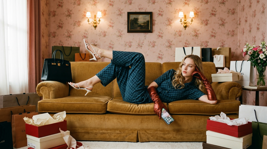
Product meets atmosphere
The best-performing static ads in beauty and fragrance are not the ones stripping everything away nor the ones drowning the product in lifestyle context. They sit somewhere in between. The product is clearly the subject. But the light, texture, and colour temperature around it do as much work as the product itself. Prada Beauty does this well. The product dominates the frame, but the atmosphere around it, the surface detail, restrained color, and the way light falls make the image feel like it belongs to a specific world. You are not just looking at a product.
You are looking at a feeling. Fragrance brands live almost entirely in this territory. You cannot show someone what a scent smells like. The image has to make them feel the world it belongs to. That is a direction problem, not a design problem. A spec piece we built for Snitch perfume worked within exactly this logic, and so did our Laneige spec work. In both cases the product is the subject. The frame around it does the heavy lifting.
Atmosphere Without The Product Front And Centre
Glossier has built an entire visual identity around this. Their static digital ads rarely feel like advertising. They feel like a photograph someone took in a room you want to be in. The product is present, but the mood does more work. Skin that looks real, lighting that feels like it came through a window, backgrounds that belong to a life rather than a set. It works because it does not ask you to want the product. It puts you in a world and lets you notice the product once you are already there.
A Copy That Stops
Sometimes the image is the context and the text does the actual work. A considered background, not much happening visually, and a headline specific enough that the right person cannot scroll past it. This works well for brands with a strong point of view, or for retargeting audiences who already know the product and just need the right line to convert. The risk with copy-led static ads is writing something too clever or too vague. Neither lands. Specificity is what makes a headline feel like someone wrote it directly for you. That feeling of being spoken to is what makes a static ad stop the scroll.
Composition is a Direction Decision, Not a Layout Decision
There is a difference between arranging elements on a frame and directing a frame. Design arranges. Direction decides what the viewer feels and where their attention moves. In a static ad those two things must be the same decision made at the same time.

Hierarchy is what makes that work. The primary subject, whether a product, a face, a texture, or a headline, needs to own the frame clearly. Through scale, sharpness, light, or placement, something has to read as the thing. When multiple elements compete at the same visual weight, the eye has nowhere to settle. This is one of the most common reasons well-produced static digital ads underperform. The composition is balanced when it should be dominant.
Why Negative Space Is Not Emptiness
Negative space gets misread as emptiness. It is not. It is pressure. An image where the subject occupies a tight portion of the frame and the rest stays open creates visual tension. The eye moves toward the subject because there is nowhere else to go. That directed motion keeps someone in the frame for an extra half-second. Half a second in a feed is everything.
Copy Placement Is a Compositional Choice
In most static ad production, text and image are treated as separate tracks assembled at the end. The visual gets designed, and the headline gets written; then both get put together. This is almost always the wrong sequence.
Where the text sits in the frame changes what the image means. A headline in open negative space beside a tightly cropped subject feels very different from the same headline at the bottom of a busy frame. One feels intentional. The other feels like a label. Same words. Completely different read.
In a static ad there is no build. The headline either lands in the first instant or it is gone. The best-performing static digital ads are not the ones with the most interesting writing. They are the ones where the headline names something the viewer already feels or wants. Clever copy asks for a moment of comprehension that a moving feed does not give. Specific copy does not need that moment.
Where We Have Landed on This
We produce static ads as part of the same directed system we apply to everything else we build. Every frame starts with the same questions: Where does the eye land first? What does the light say about the subject? Is the background earning its place? And does the text sit inside the image or just on top of it? The format is still the same. The thinking behind it should not be.
A static ad that stops the scroll is not an accident of good design. It is the result of small, directed decisions about composition, contrast, hierarchy, and where the words live in the frame. The brands that treat it that way are the ones whose static ads actually work.
The Honest Truth
Static ads are not a simpler alternative to video; they are a more demanding discipline. Without the luxury of time to build tension, audio to evoke emotion, or movement to guide the viewer’s eye, a single frame must do the impossible in a fraction of a second. It either stops the scroll, or it is invisible.
Success in this high-stakes environment isn’t about having the most extensive brand guidelines. It belongs to the brands that treat composition, contrast, and copy placement as a single, intentional, directed decision, approaching every still image as a frame that must earn its right to be seen.
This is where Rivoq Labs bridges the gap between raw AI generation and cinematic craft. We apply the same rigorous creative direction to our campaign visuals as we do to our brand films. By treating every still as a high-fidelity ‘directed frame,’ we help global D2C brands move beyond generic assets to visuals that command attention and drive performance through pure aesthetic intent.